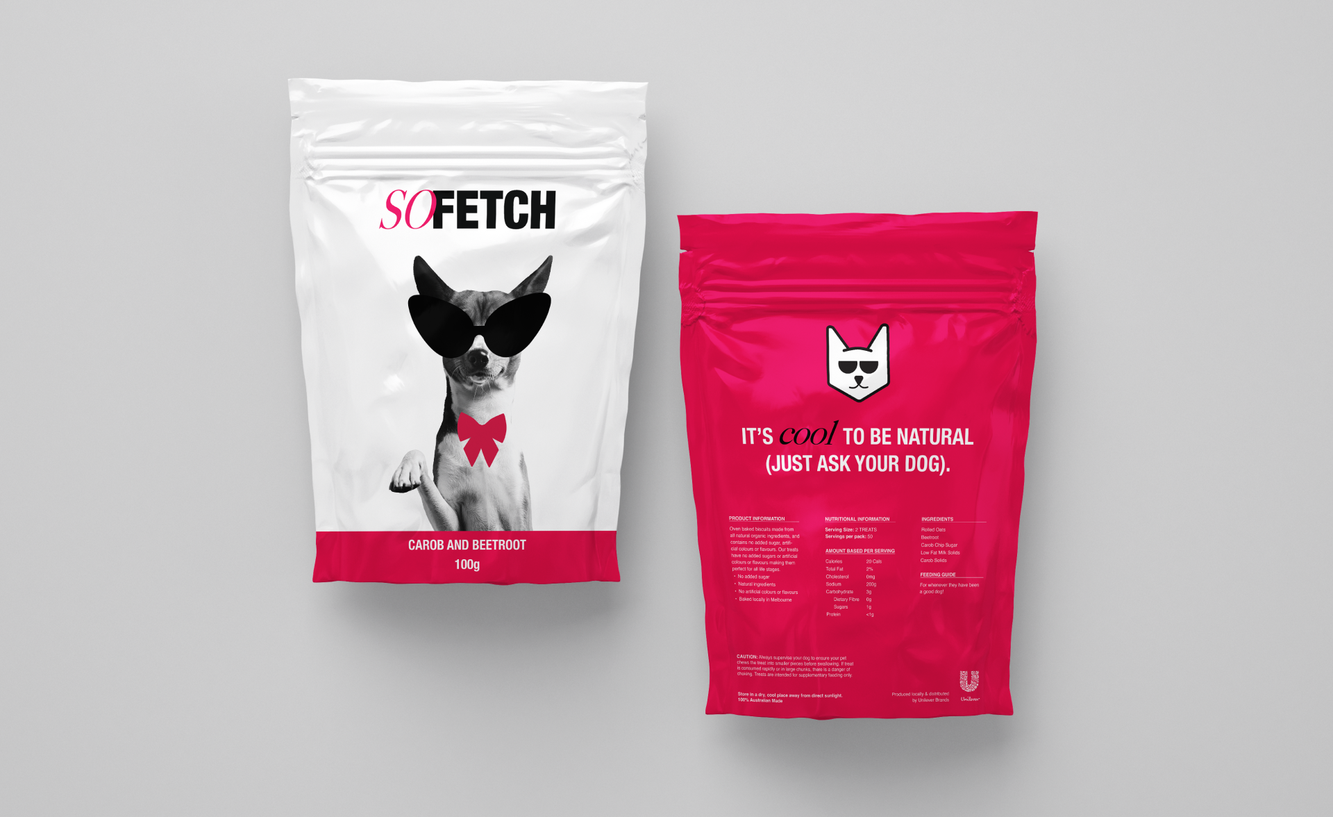
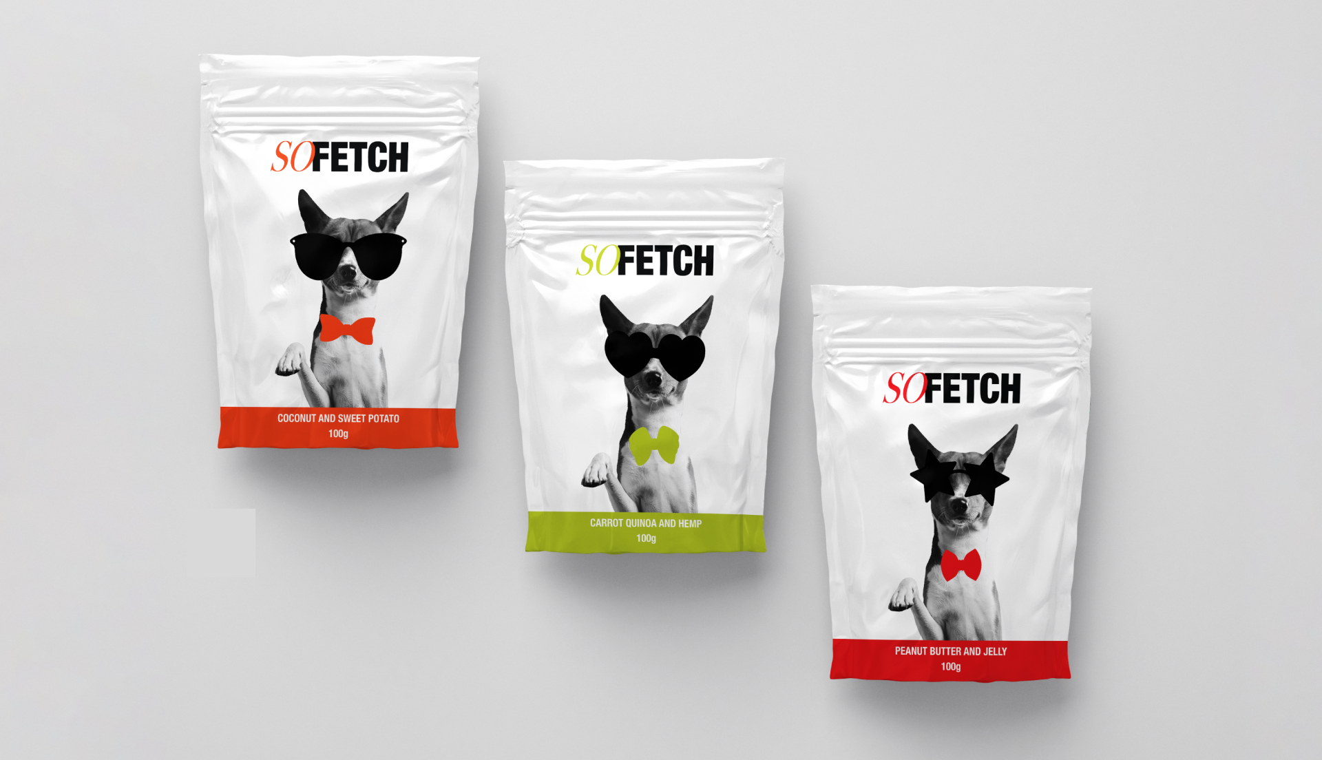
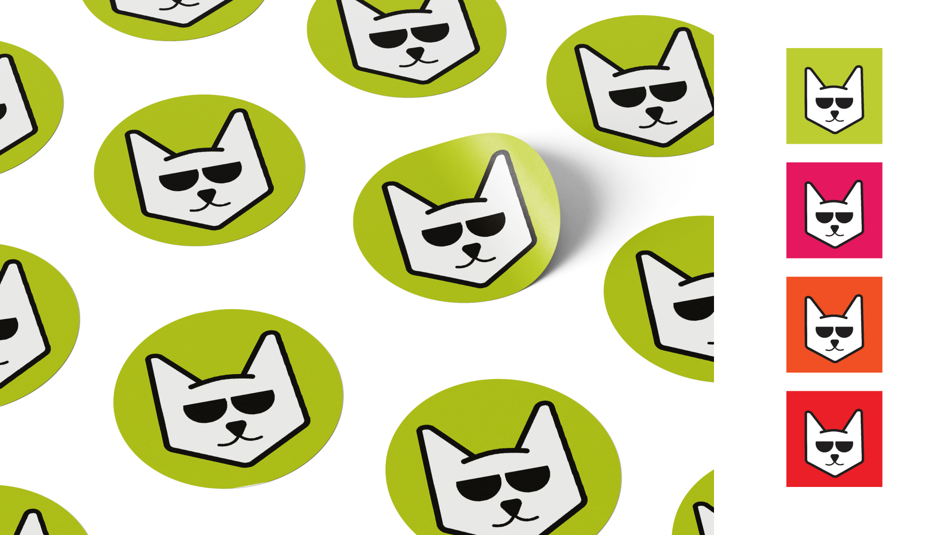
Packaging: So Fetch
Key Words: Cheeky, bold, honest.
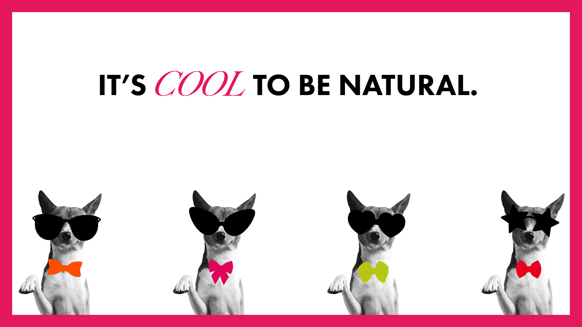
The Challenge:
Create a brand identity and packaging that stands apart from the crowd for a local business baking natural dog treats for the hounds of Melbourne.
The Solution:A concept drawing on pop culture reference, ‘fetch’—meaning awesome or cool— to advertise that it’s cool to be natural. These fun and natural treats are baked in Brunswick and fetched by good dogs* across Melbourne.
*Every dog is a good dog.


[—0—] I acknowledge the traditional owners of the land I live, work, and play on, the Wurundjeri people of the Kulin Nation. I pay my respects to elders past, present and emerging and recognise their continuing connection to land, waters and culture. Always was, always will be.